Designing a Digital Product? Feng Shui Might Offer Surprising Insights
The last few decades have seen the rise of the internet, social media, smartphones and the digital workplace, and with it — a new kind of home.
According to a report by the Nielsen Company, adults in the US spend over 10 hours a day consuming media. One could argue that we are living a larger part of our lives within our digital devices than our physical resting places.
Interior designers study the art of creating beautiful, but more importantly, livable space. If digital is here to stay, designers of our metaphysical homes — websites, software, mobile, and desktop applications — might benefit from borrowing a concept or two.
The question I really wanted to ask, however, is: How can the principles of feng shui be used to improve user experience design?
What is feng shui and how is it relevant to the user experience?
Feng shui is not just about knowing where to put mirrors and plants. It’s about using the space as a way to teach us to be more mindful of creating balance in our lives.
The purpose is to create harmonious energy within a living space and even channel it towards specific goals.
Designing a digital platform using “energy patterns” might seem laughable to some. But, if you stop and think about it, it makes perfect sense. Energy is simply a flow of intention and action, and as UX designers, our goal is to subtly guide this towards the desired action.
When we remember that we are designing for our users’ subjective emotions, reactions, desires, goals, and expectations — energy can be used to describe the complexities of the human psyche.
Using some basic principles of feng shui can help product managers and UX designers gain a deeper understanding and how humans operate and create more harmonious products.
Here are a few of the principles I found helpful:
Be attentive to your entrances
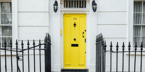
The front door is very important in feng shui tradition. This is how Chi, or Universal energy, enters the house.
Similarly, the home page or home screen of any web-based platform is a critical point for your digital users. A UX designer should ask: Does my entrance appeal to the target audience? Do users feel anxious or at ease when they enter my page or product? Are the next steps intuitive?
Here is how feng shui treats entrances:
- Maintain a positive relationship between the door and the house structure. It is important that a user landing on your homepage will understand the various actions available to them. The menu should be visible and easy to decode.
- Choose a door color that is in harmony with the feng shui element. Make sure your color palette is uniform and speaks to your brand.
- Make sure your front door is well-cared for. You should not have bugs anywhere on your website, but the homepage is especially critical. Show your users that you care about this ‘home” so they will find it pleasant to visit.
Check the flow of energy
Feng shui asks that homemakers get into the habit of checking the flow of Chi in the home. Does the energy flow freely to all the areas of your home? Or does it get blocked before reaching a certain room? We should always we remove barriers and ensure energy flows freely and without constraint.
While energy flows within physical spaces — user flow within digital spaces.
Check the user journey to see where visitors are getting stuck. If an obstacle is left unchecked, users may become frustrated and even abandon your platform.
The best way to examine the user journey is by using data-driven insights. With the help of platform analytics, product and UX experts can pinpoint the trouble spots and help revise the flow.
Clear the clutter
A huge step towards a happier home is clearing clutter. In a clear and organized space, energy can flow freely and feelings of heaviness and unrest might disappear too.
This is true for any digital platform. The user is easily overwhelmed by noisy design. Simplify your color scheme, shapes, add some blank space in order to emphasize the elements that are truly important.
There is a reason minimal design is so appealing. Especially in the digital space, we are constantly bombarded by a million different things screaming for our attention. A sleek, organized platform is like a breath of fresh air — it allows users to relax and quiet their minds for a moment.