How to Use Behavioral Economics to Boost Your Conversion Rate
Everyone knows how important the user experience is to acquiring new customers and boosting loyalty. But no one ever said it was easy.
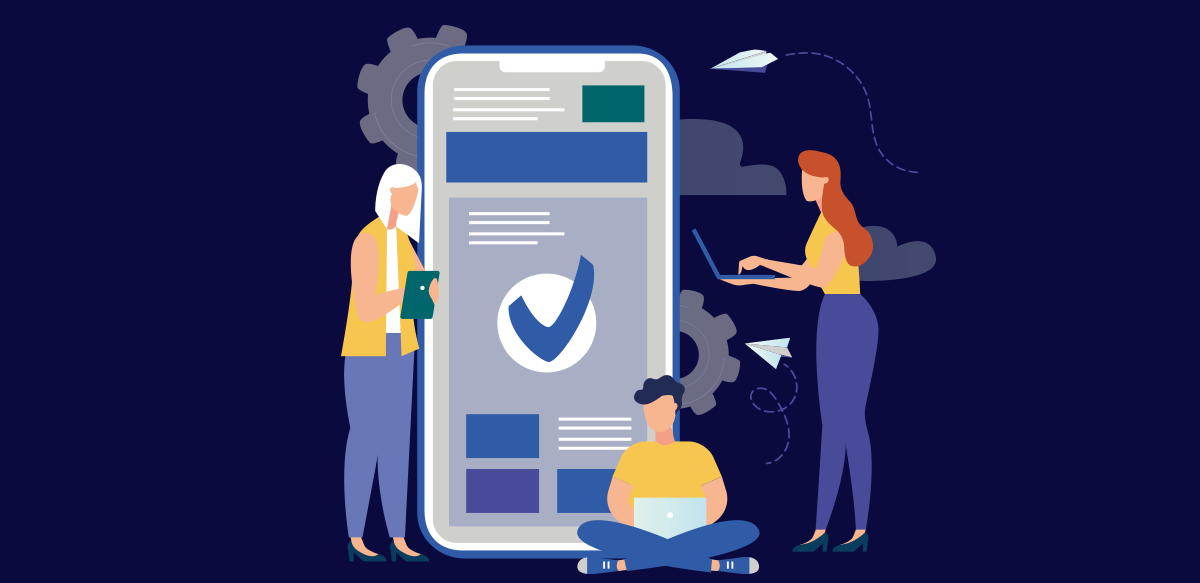
When conversion rate optimization is the goal, striking the balance between great aesthetics, access to information, and seamless navigation is essential. But often it feels like one giant tug-of-war.
This is when you need to remember the thing you already know: converting users into loyal customers requires understanding their goals and their behavior.
But if you go even deeper, if you learn to understand the cognitive biases and processes that drive human behavior, you can nudge your users toward the desired action.
Applying behavioral economics principles to your UX can have a profound impact on your conversion rate and customer loyalty.
Dive Deeper: Great UX is a Balancing — Act Here’s Why
4 behavioral economics principles UX designers should know
Creating an attractive and seamless user experience on digital platforms is an art and a science. By looking beyond user goals and into their thought processes, you can become a “choice architect.”
Everything from the user interface to the content to the flow can be designed to steer users exactly where you hope they’ll go. And, with the help of added digital solutions, you can make guiding them easier than ever.
Here are four principles of behavioral economics that are invaluable to UX design.
1. Decision paralysis
When a user is faced with too many options, the phenomenon of decision paralysis can set in.
This occurs on websites or apps that have a cluttered interface — too many buttons, tabs, images, and text.
There are too many things facing your user. Where do they begin? Even if a visitor landed on your page with a certain intention, a crowded interface can be distracting and cause “choice overload.”
Decision fatigue, automatically choosing the default option, or deferring a decision altogether are the likely consequences. In other words, bombarding your users with too much information will probably drive them to leave your page in search of something simpler.
The key to avoiding decision paralysis is to mark an easy trail for your user to follow. Creating user journeys based on various customer personas is the first step to achieving this. By completing this step, you will better understand how to meet the goals of your users while promoting your own.
Digital tools that use artificial intelligence and automation also help ensure you prevent decision paralysis. For example, say a user lands on your website in search of a specific product. Instead of relying on him to find it, a chatbot could appear and ask what he is looking for. Bypass all of the searching and decision-making and simply take your users to their destination.
2. Defaults
In order to avoid complexity, many people go with the default option.
A default is a predetermined course of action that occurs if the decision-maker (the user) doesn’t actively choose something him or herself. Creating defaults can be an extremely effective way to drive people toward a desired decision.
For example, in nations where organ donation is the default choice (i.e., people must actively opt out of organ donation), the rates of organ donation are far higher.
Whether the cause is decision paralysis or something else, we know that people don’t always take action. This is a great  UX opportunity — you have the power to create a default that swiftly steers your user toward the decision you want (to make a purchase, sign up for your newsletter, download a free trial, whatever it may be).
How do you put a default in practice on your website or app? Digital solutions that use context-sensitive factors to analyze a user’s behavior and intentions are a proven effective method.
By analyzing various user factors, such digital solutions can deploy an effective default in the form of tailored pop-ups that take your user straight to the right landing page. After a user is idle for a certain amount of time, the pop-up can appear, removing the need for your user to take action or spend time searching your site.
3. Anchoring
Anchoring is a cognitive bias that causes people to focus on the first piece of information they see and use it as a reference point when making decisions.
Companies use it all the time in sales. When a customer sees a T-shirt is $39, they use this initial price as the anchor. When the store puts the shirt on sales for $29, the customer is more likely to see this as a great deal because they are comparing it to the original price, even if they wouldn’t have bought the shirt for $29 in the first place.
It’s important to keep the notion of anchoring in mind when creating your UX, as the information, pictures, and content your users see first will become anchors in their minds.
Depending on your primary goals, the entire interface on your website or app’s home page should be designed with the most important references to you. Prices for featured products, descriptions, and other information should be chosen wisely and with purpose.
Create a seamless user experience with WalkMe. Request a demo.
4. Friction costs
Even seemingly tiny barriers can create significant friction and ultimately prevent someone from completing a task.
When the “friction costs” are too high, your users are far less likely to take the desired action.
Poor UX is loaded with friction costs. Interfaces that are difficult to navigate or not intuitive add friction costs. Inaccessible information adds friction. The need to complete lengthy forms or lots of clicks before completing a task adds friction.
Minimizing these hurdles and making the user journey as smooth as possible is the key to achieving a higher conversion rate and satisfying your users.
Digital solutions that take your users by the hand and guide them through processes on your website or app instantly eliminate friction by simplifying their journey. Contextual guidance tools assess a user’s behavior and persona details to proactively deploy help prompts and take them through a task step-by-step, from beginning to end.
Don’t just be a UX designer
Be a choice architect. By understanding the ways in which humans perceive the context around them, make decisions, and behave in certain ways, you can nudge your users toward the desired action.
Your UX will be more satisfying to them, and more effective for you.
WalkMe’s Digital Adoption Platform (DAP) transforms the user experience in today’s overwhelming digital world. Using artificial intelligence, engagement, guidance, and automation, WalkMe’s transparent overlay assists users to complete tasks easily within any enterprise software, mobile application or website. Discover how a DAP can revolutionize your business.